PRISMOLOGIE
Award-Winning Visual Identity & Packaging That Makes A Splash, From eCommerce To Retail
Prismologie is a skincare line that needed a bold new brand.
We created an award-winning visual identity and packaging for a standout launch, online and in-store.
The Challenge
The cosmetic category is notoriously minimalist. Typically, brands fall into step with a convention of visual restraint and muted palettes.
Prismologie had other ideas.
The mother-daughter duo came to us in search of a vibrant identity and distinctive packaging that could cut through the monotony. Something that would make the category – and the world – a brighter place.
The Bright Idea and the Brilliant Execution
We invented a new beauty brand that celebrates self-expression, rather than shying away from it.
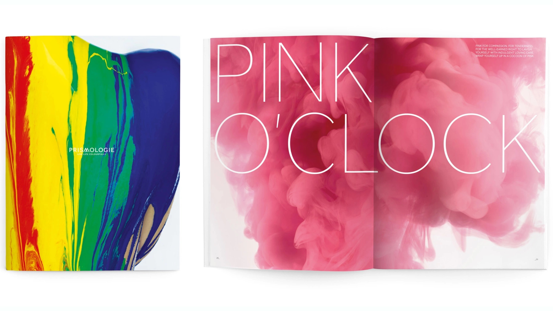
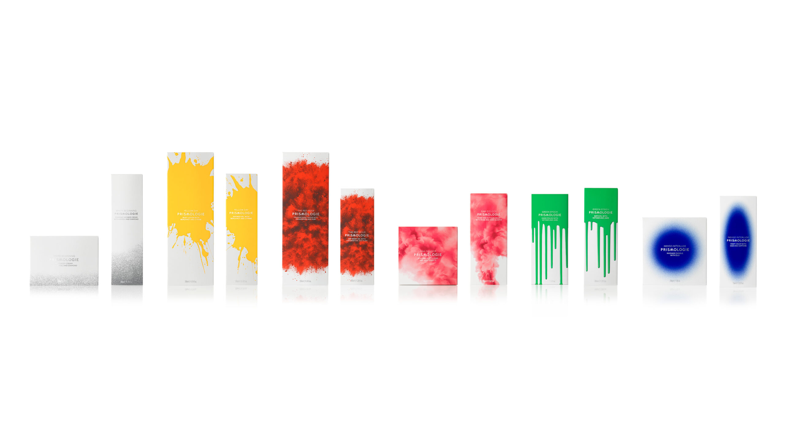
Our bright idea centered on the concept of reflecting the many facets of mood through color. The brand name and strapline, “Live life colorfully”, were born.
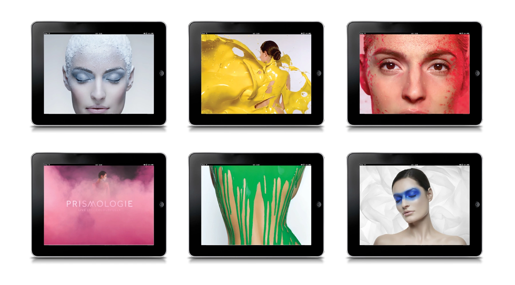
This evolved into a kaleidoscopic product range and visual identity, where a different color is the hero of each formulation – yellow for optimism, rose for tranquility, green for balance, etc. With splashes and clouds of vivid pigment bursting onto pack and digital canvases.
The Result – Meaningful Change and Tangible Efficiencies
A brand that inspires women to express themselves and their mood.
A launch campaign and pack design that made its mark in the skincare space, taking home six awards for branding brilliance.
See more case studies
View allContact us to see how BRANDED can help