Bunchies By Happy Golfer
Fuel for the rhythm of a round
Search
ONE is Japan’s leading shipping container group. Following the merger of its owners, NYK, MOL and K Line, ONE needed a unified brand identity to stand out in a sea of sameness.
Shipping containers aren’t exactly known for their bold, disruptive branding. And that’s precisely where ONE saw an opportunity to cement its reputation as a titan of the sea.
The team approached us for a rebrand that would make ONE’s merger as successful and seamless as possible.
They wanted to transcend the traditionally functional aesthetic of the humble yet mighty shipping container. To create a strong, emotionally resonant brand that could translate easily to customers and employees.
On top of this, the rebrand needed to be rolled out at an immense scale, encompassing a global network of containers and ships.
We identified a brand truth that all three businesses could rally behind. This gave way to a unifying name and a rousing strapline.
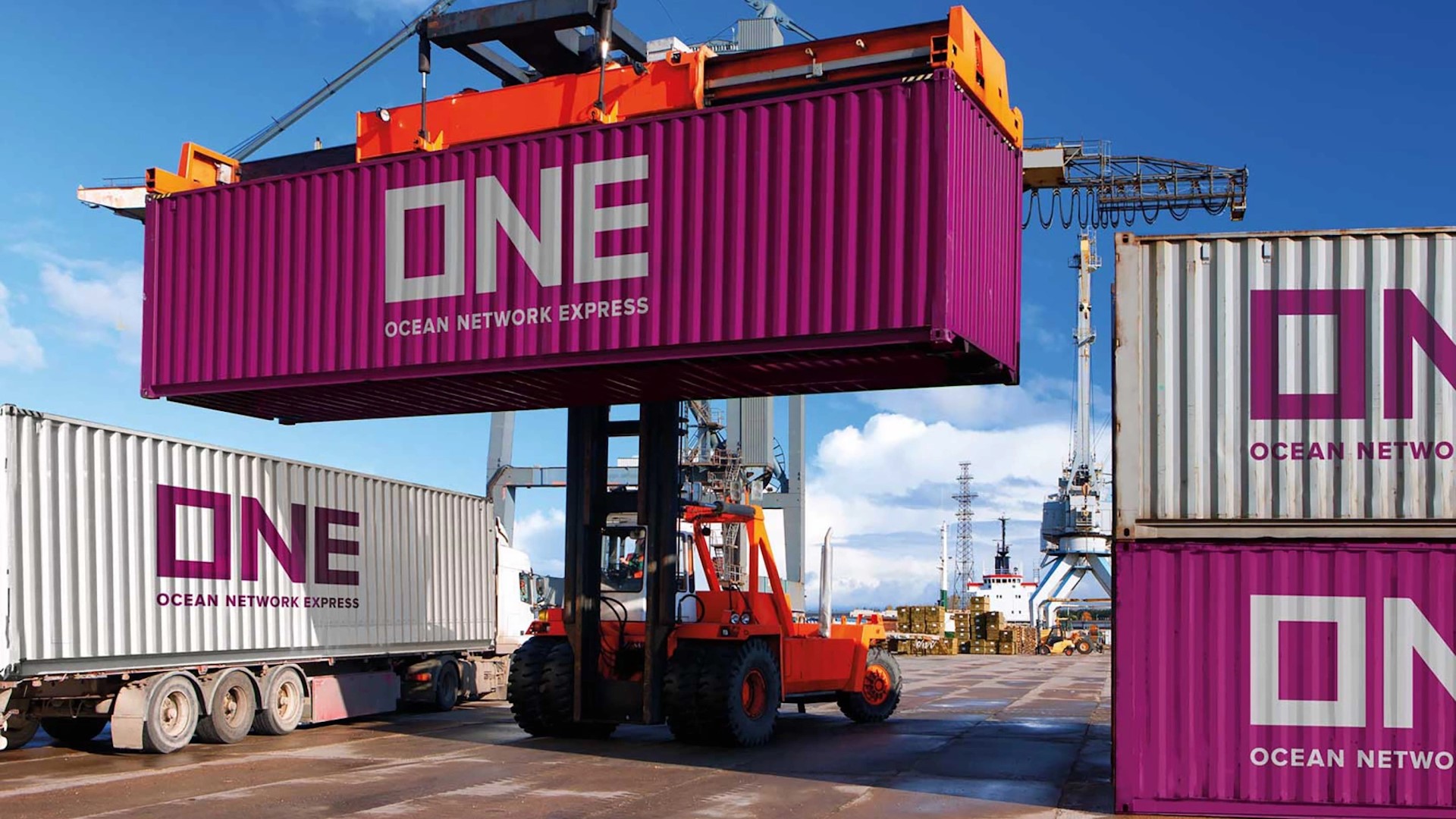
Building on this theme of singularity, we landed on ONE’s most distinctive visual asset: an eye-popping magenta, inspired by Japan’s iconic cherry blossom.
The shipping container itself served as a muse for the visual identity, which features a recurring frame motif – symbolizing ONE’s ability to transport precious cargo across the seas and cater to the world’s needs.
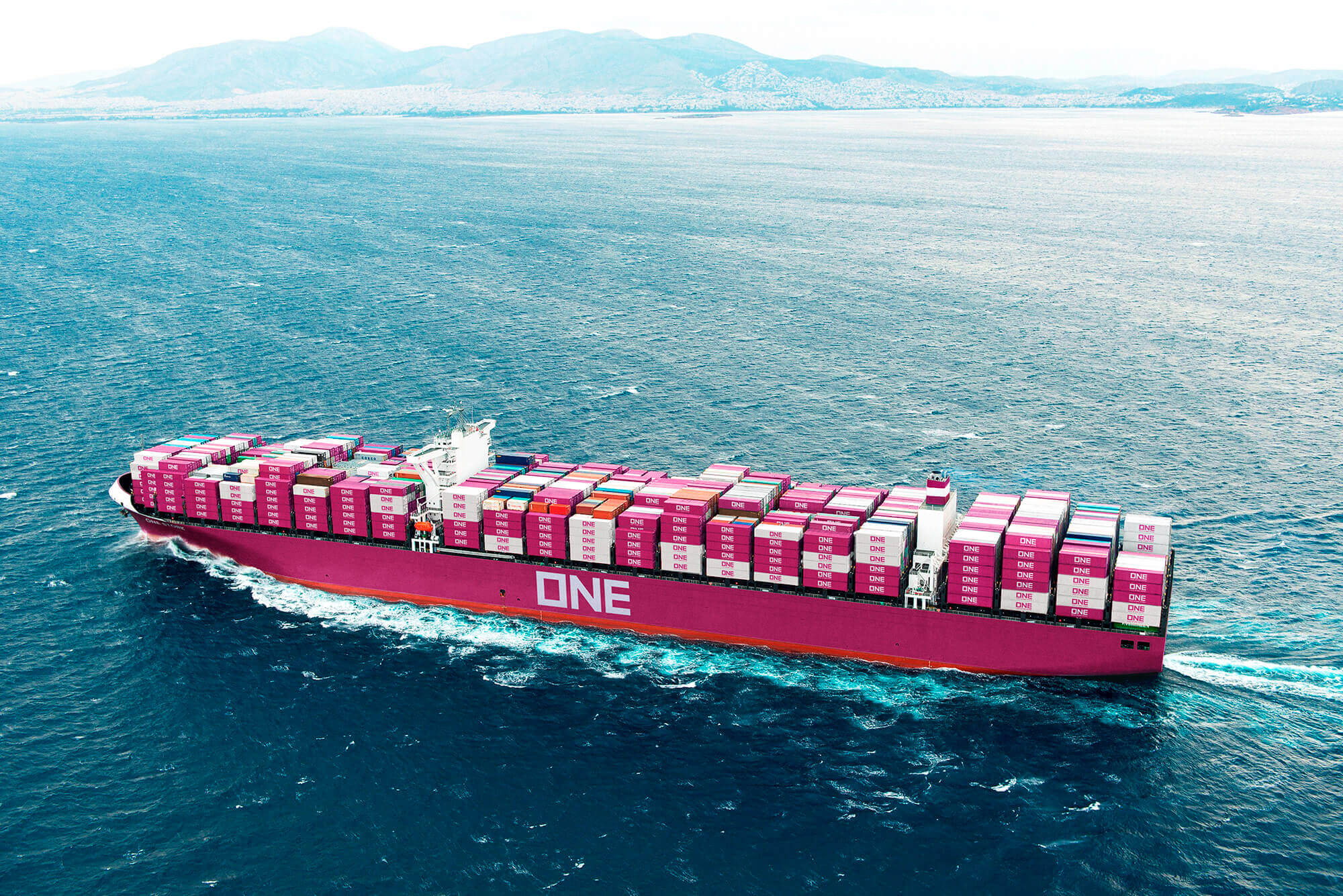
The new identity was deployed across two million containers and 240 enormous ships (the largest of which spans four full-size football pitches).
An unassailable new brand identity to bring harmony to the ocean. Taking home gold for Transform Awards “Best Rebrand Following A Merger”.